CASE STUDY
Chosen Foods Avocado Oil Mayo
Packaging redesign for a five-flavor healthy mayo line anchored by a hero ingredient
The Challenge
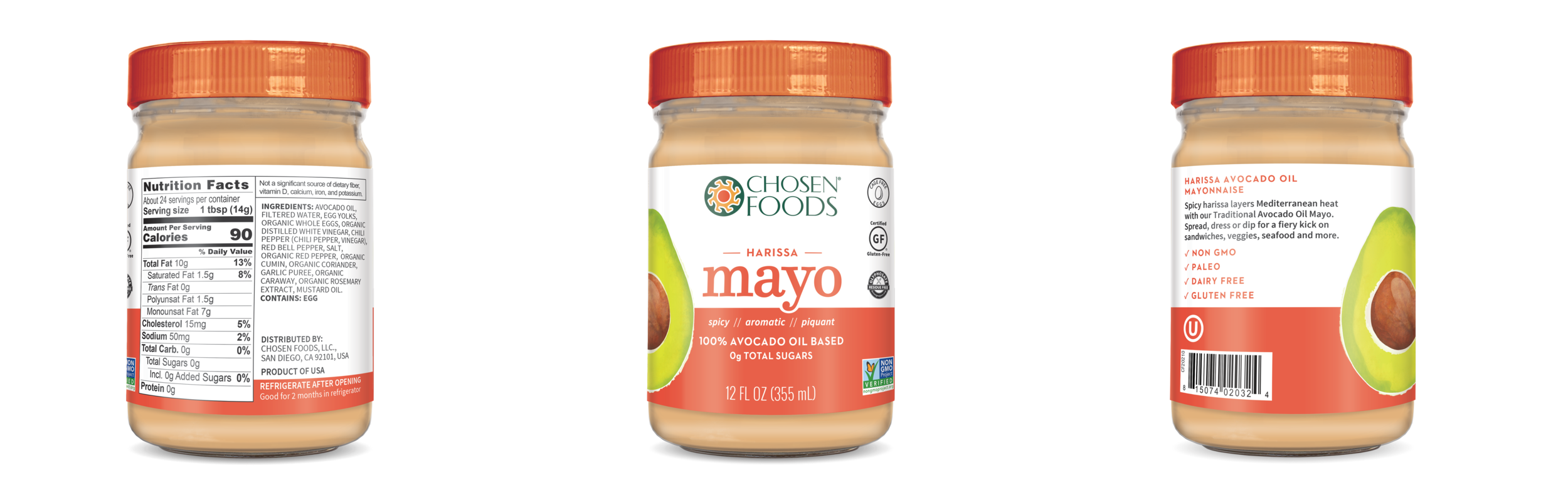
Chosen Foods was launching their Avocado Oil Mayo line for the first time including five flavors of non-GMO mayonnaise, made with their signature avocado oil. With distribution planned across the United States, Canada, Mexico, and Europe, the packaging needed to work in multiple languages and across multiple retail environments from day one. The primary goal was securing placement at Costco, a retailer with exacting standards for shelf presence and consumer clarity. In a mayonnaise category defined by familiarity and decades of brand loyalty, the design had one job: make a health-conscious shopper stop, understand immediately what made this different, and reach for it.
The Work
Mindsy identified that the central design challenge was permission. The brand needed to give the consumer confidence that this product would deliver the familiar mayo experience she already loved, made meaningfully better. The solution was to lead with the hero ingredient. Placing the avocado large and front-facing on the jar made the differentiator impossible to miss and instantly communicated the brand's commitment to clean, intentional ingredients. A custom icon system reinforced the non-GMO and clean ingredient story at a glance, while intentional color choices and a clear design hierarchy gave the line the shelf cohesion it was missing.
SCOPE
Aware
DELIVERABLES
Packaging Redesign Across Five SKUs
Hero Ingredient Visual Treatment
Icon System Development
Color and Design Hierarchy System
Sell Sheets
The Shift
The redesigned Avocado Oil Mayo line communicates its point of difference clearly and confidently on the shelf. The cohesive visual system across five flavors strengthened Chosen Foods' brand presence in the category, the clean ingredient story is legible at a glance, and the redesign contributed to increased ROI for the company.