

CASE STUDY
Daybreak Seaweed Co.
Women-owned West Coast seaweed brand on a mission to make culinary seaweed an American kitchen staple
The Challenge
Catherine and Avery had built a women-owned, West Coast seaweed brand with a strong sustainability mission, premium product quality, and real potential to change how Americans cook. But on the shelf, the brand was disappearing. Flavor differentiators alone were not creating connection, consumers were confused about what the product was and how to use it in everyday cooking, and the packaging was not stopping anyone in the aisle. The mission was clear to the founders. It was not yet clear to the shopper standing in Whole Foods.
The Work
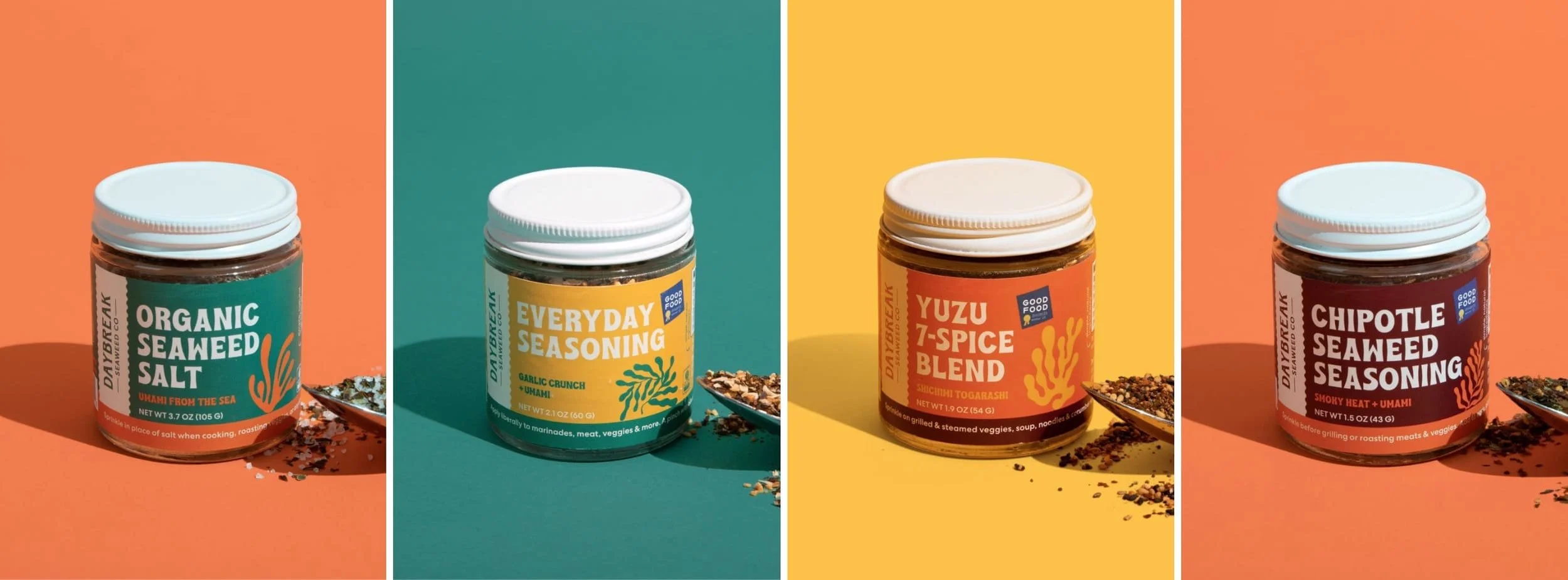
Mindsy began with on-the-ground consumer research, which included visiting grocery stores across the US, conducting interviews with real shoppers, and mapping the gap between what Daybreak stood for and what the market could currently see. What surfaced was that consumers were genuinely willing to pay premium prices for locally grown, sustainable products. The barrier was education and recognition, not desire. From that insight, Mindsy built a complete brand strategy, refreshed the visual identity, and redesigned the packaging to make seaweed feel like an everyday kitchen staple rather than an exotic ingredient that was bold enough to stand out on shelf, clear enough to answer every question a shopper might have before she even picked it up.
SCOPE
Amplify
DELIVERABLES
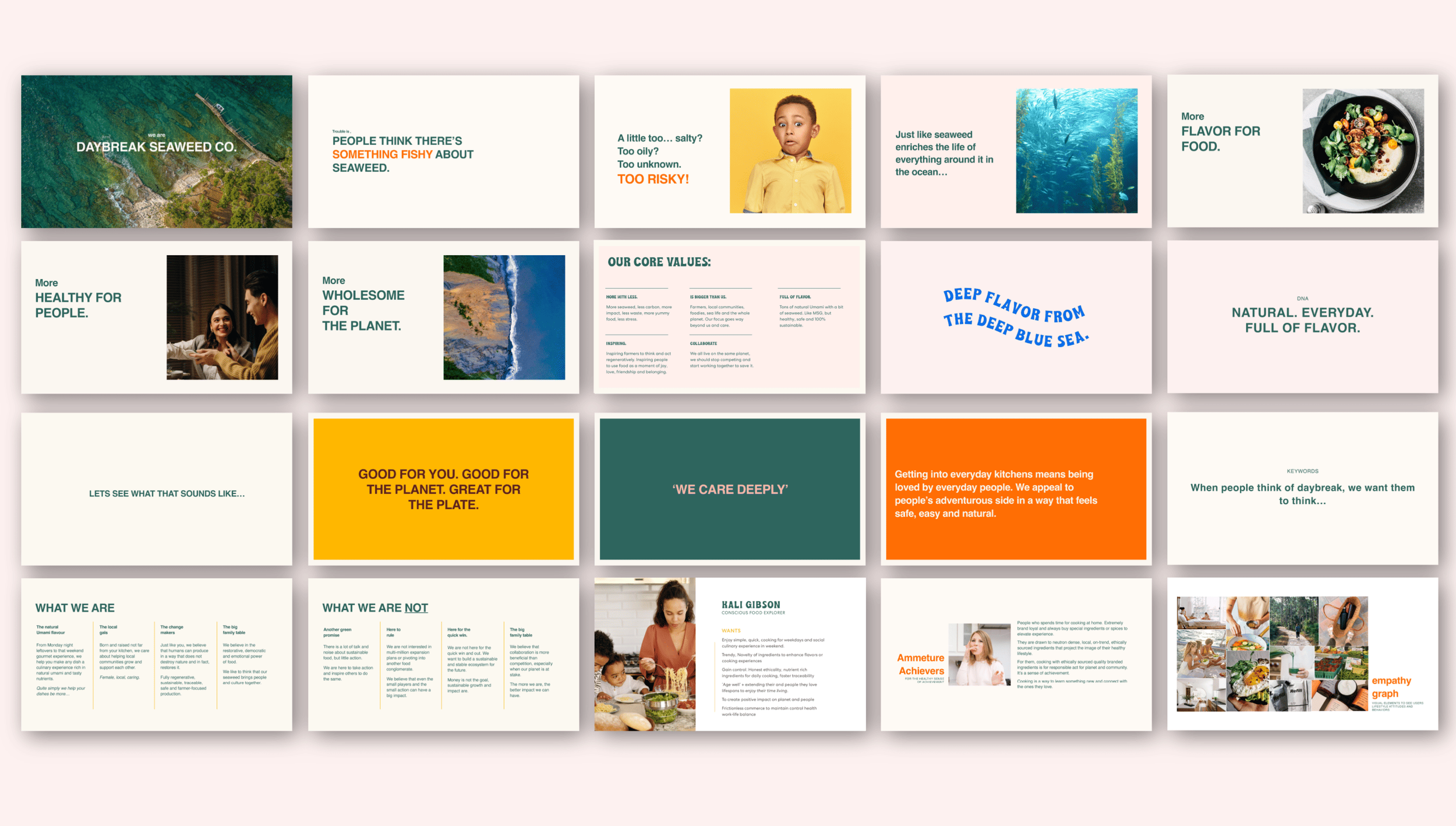
Brand Positioning
Audience Profile + Customer Journey
Competitive Audit
Messaging Framework
Brand Verbal Identity
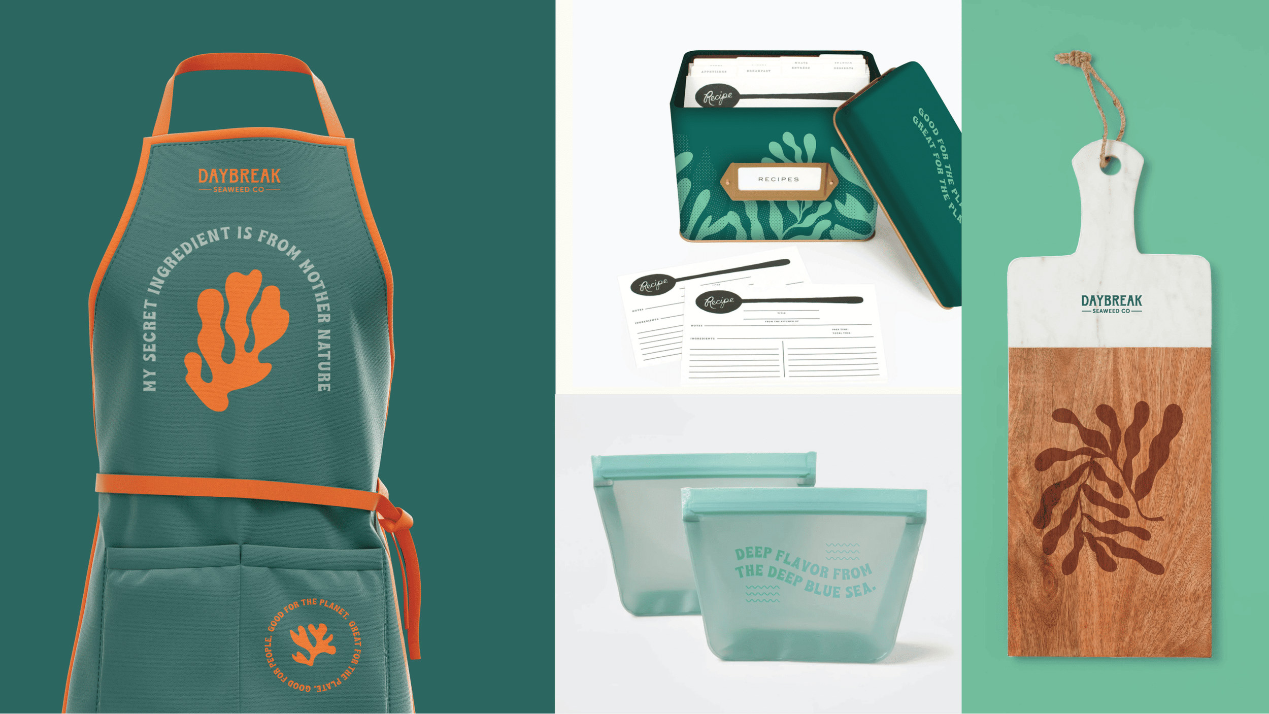
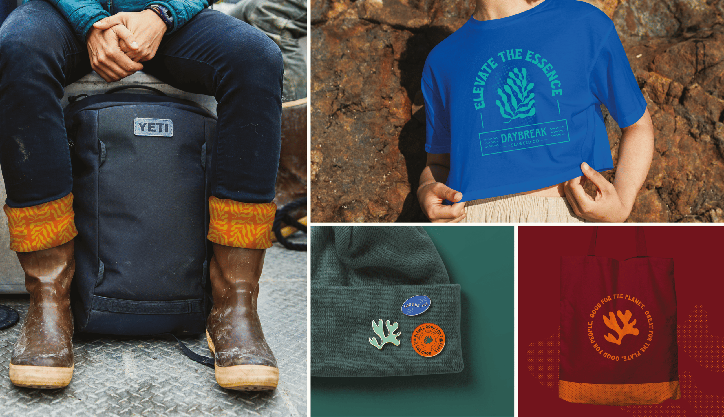
Visual Identity Refresh
Packaging Design
The Shift
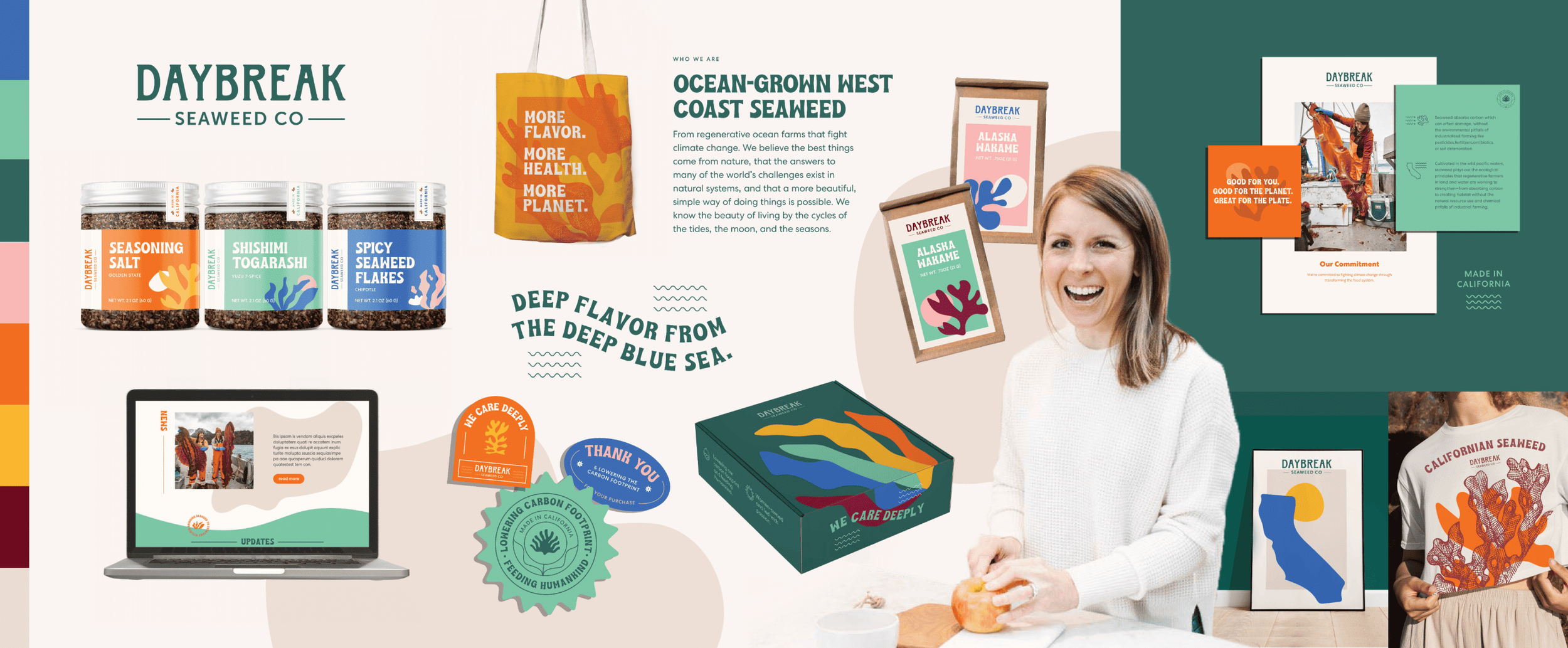
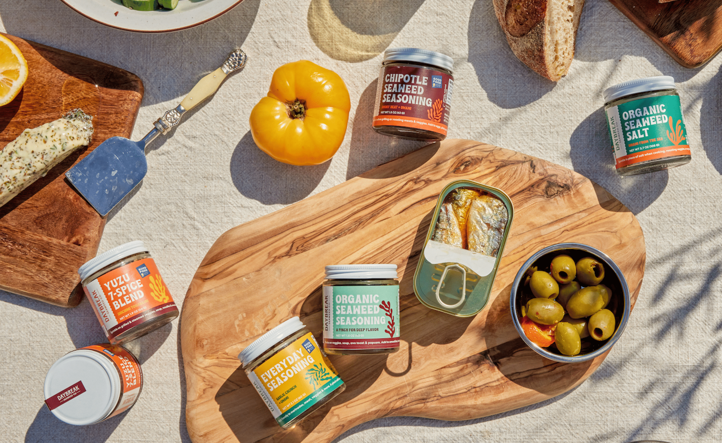
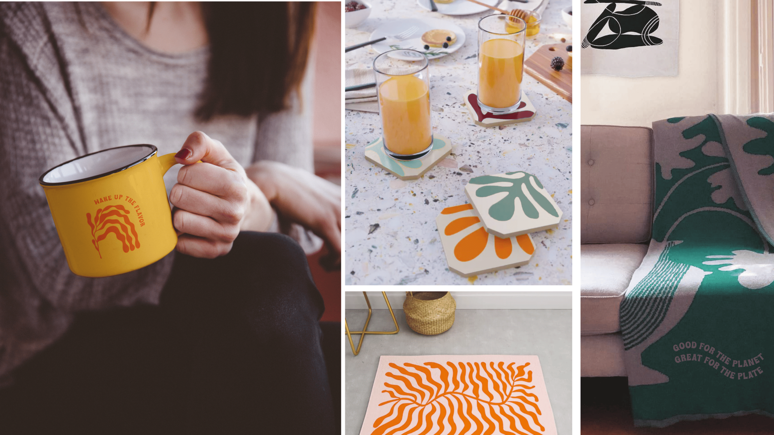
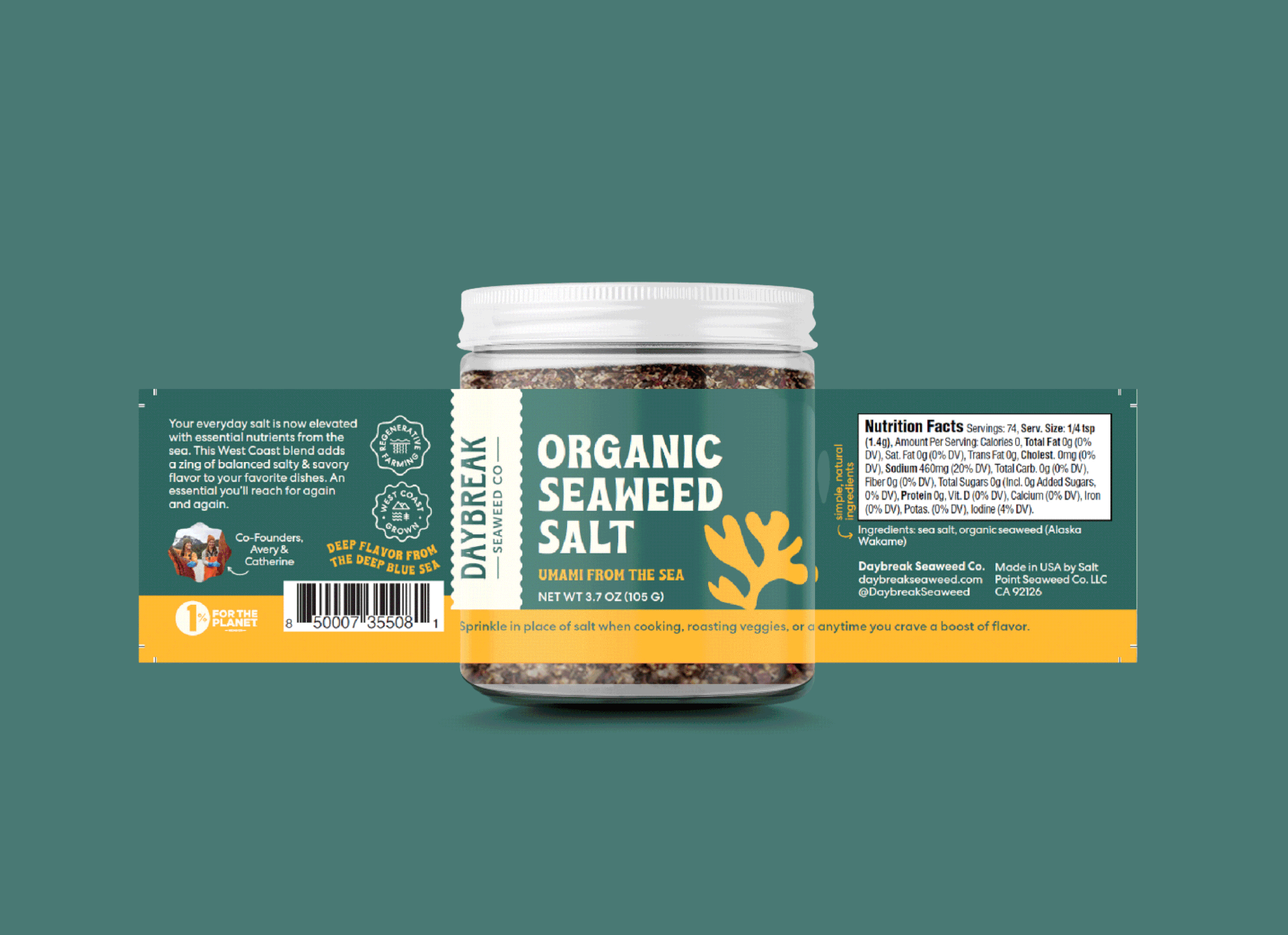
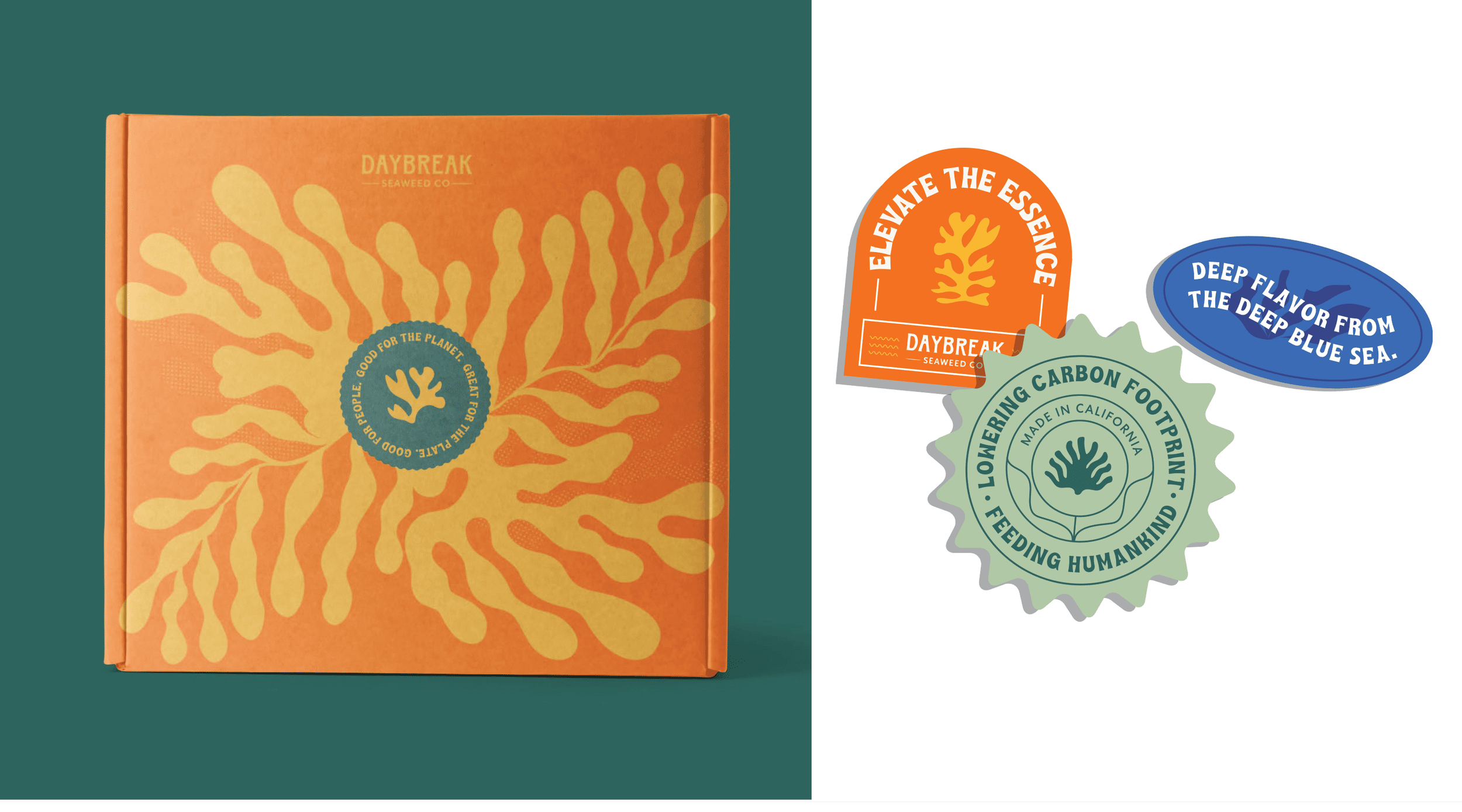
Daybreak Seaweed now has packaging that earns its place on the shelf next to established competitors while also being visually distinctive, immediately informative, and unmistakably on mission. The new brand direction positions seaweed as an everyday umami alternative rather than a specialty product, giving Catherine and Avery the language and visual presence to grow into national retail with confidence. The brand finally matches the quality of what is inside the bag.

Intentional Journey
Heart-to-heart interviews, and guess what? We struck gold.
We started by rolling up our sleeves and diving into research. We wanted to know what the people really wanted – so, off we went to grocery stores all across the US. We talked to the folks browsing those aisles, had some heart-to-heart interviews, and guess what? We struck gold. Here's the lowdown on what we discovered:
~ People were all in for supporting local farmers and getting their hands on top-notch products, ready to pay premium prices.
~ The product and its flavors were causing some serious confusion. About naming and how to use the product in daily cooking? It was like the brand experience needed a bit of a makeover.
~ Armed with these insights, we collected some nuggets straight from the horse's mouth that we could use to sprinkle magic into our strategy.
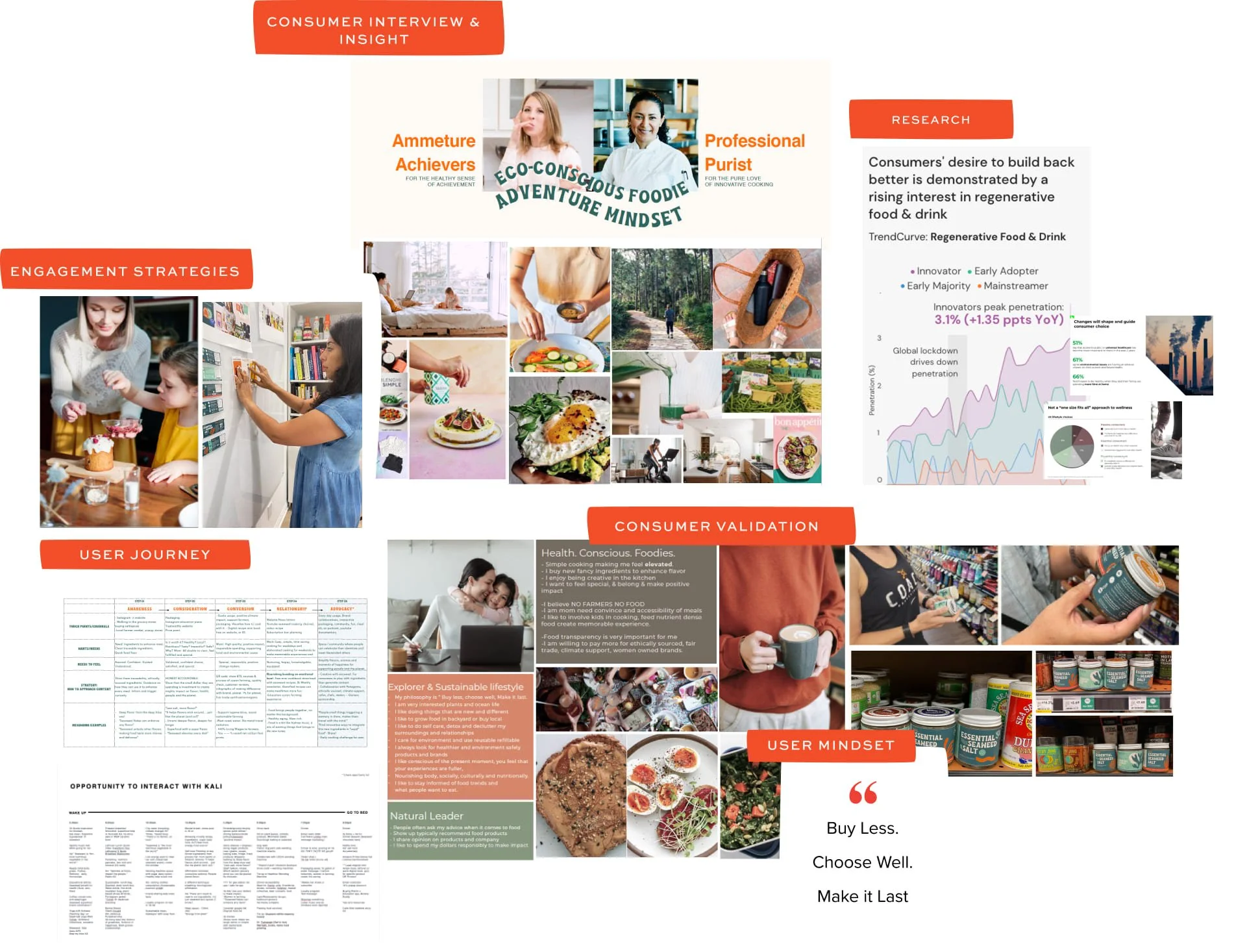
But we didn't stop at just understanding consumer behavior. Oh no, we went deep. We needed to find Daybreak Seaweed's tribe – the ones who'd go the extra mile, grab every product, and shout about it from the rooftops. Imagine a brainstorming session where the creative juices were flowing like a river. We mapped out the brand's journey so far and where it could go. And from there, it was time to have some real talk with actual people who fit the brand's profile. We hopped across different cities and had heart-to-hearts with them. We talked about their likes, dislikes, what they value, and what makes them tick. It was like finding puzzle pieces and putting them together to reveal the bigger picture.
With all that info in hand, we crafted a strategy that was as deep as the ocean from which Daybreak Seaweed emerges. We wanted to show that seaweed isn't just an exotic addition; it's your everyday kitchen superstar. We wanted people to see it as a healthier alternative to salt, bringing that umami goodness into their lives.
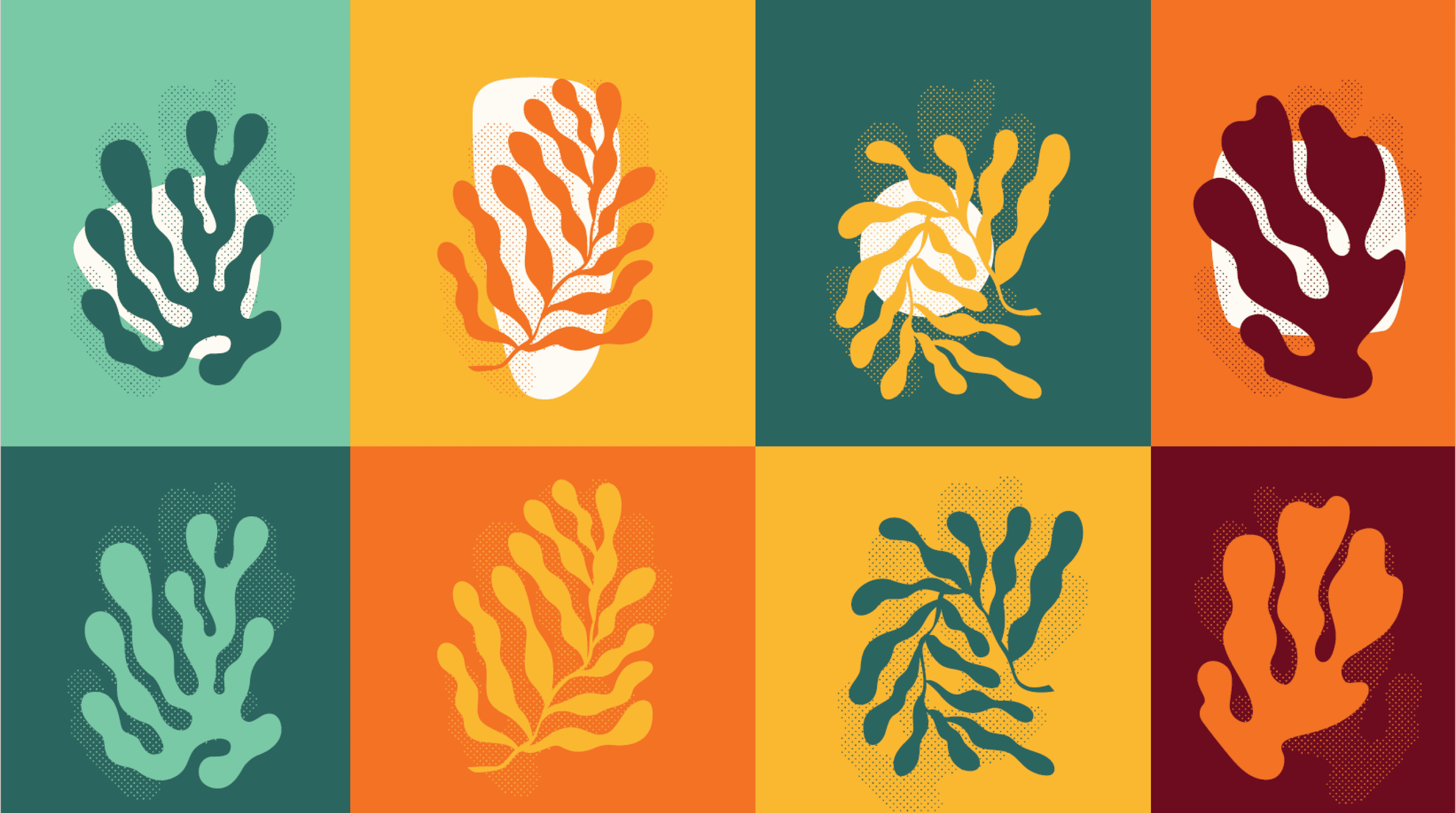
Let's Talk Visuals
We wanted the packaging to shout out "Pick me!" when it sits there on the shelves next to its buddies. So, we dabbled with shapes, bold fonts, and colors that pop, "Hey, I'm here!" To make sure we were on the right track, we ventured into retail havens like Whole Foods and Sprouts. Real consumers were our compass. Did it stand tall next to competitors? Could the details be read without squinting? Did it shout what the product was and what flavors it brought to life? Do they know how to use it? – We solved customers’ needs and desires through visual design and messaging.
And guess what? The final packaging is a stunner. It's like a story unfolding right in front of you. The shape of the seaweed gives you a sneak peek of what's inside, the name tells you exactly what you're in for, and those images? Well, they're like little info nuggets that shout, "Hey, this is Daybreak Seaweed – 100% women-owned, West Coast grown, and umami delight!"


In her own words
“I feel so much clearer, I feel like there's so many ideas, lot of new energy for Daybreak! Iʼm very grateful. This is the work we've never done before. We finally have a foundation and I feel ready to embark on that next step!”
Catherine O’Hare
Co-Founder, Daybreak Seaweed Co.

Ready to start your own?
Grateful for our
team collaborators
Lead Brand Strategist: Asha Mody
Strategy & Research Crew: Martin Zarian, Nick Ó | Designers Crew: Angela Ficorell, Zuza Hicks
Copywriters Crew: Katherine Peach, Levina Kusumadjaja | Photography: Lucianna McIntosh