
CASE STUDY
PlayPals
Premium toy sharing membership for values-driven families
The Challenge
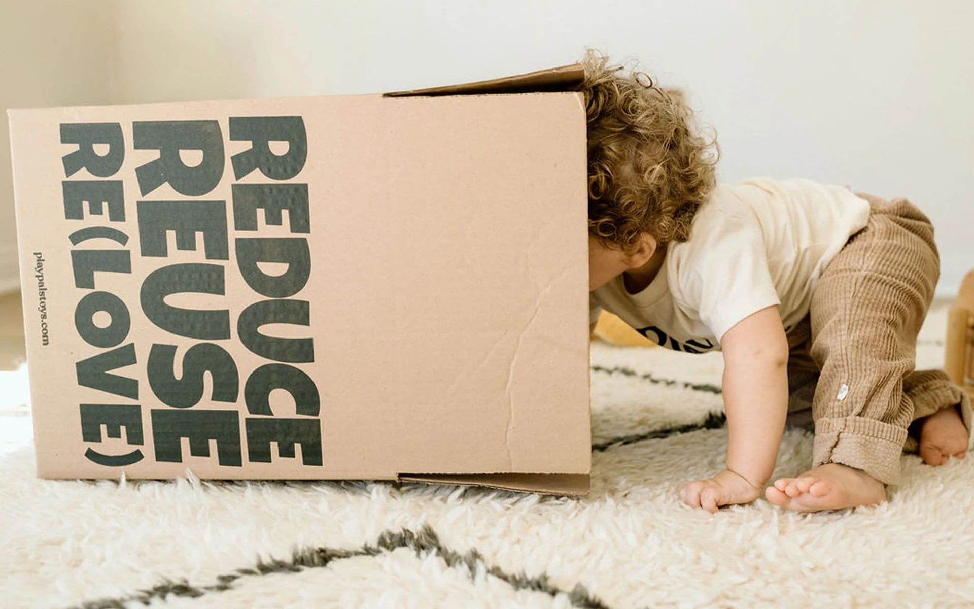
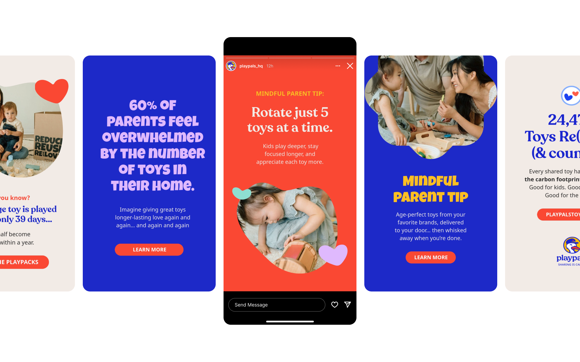
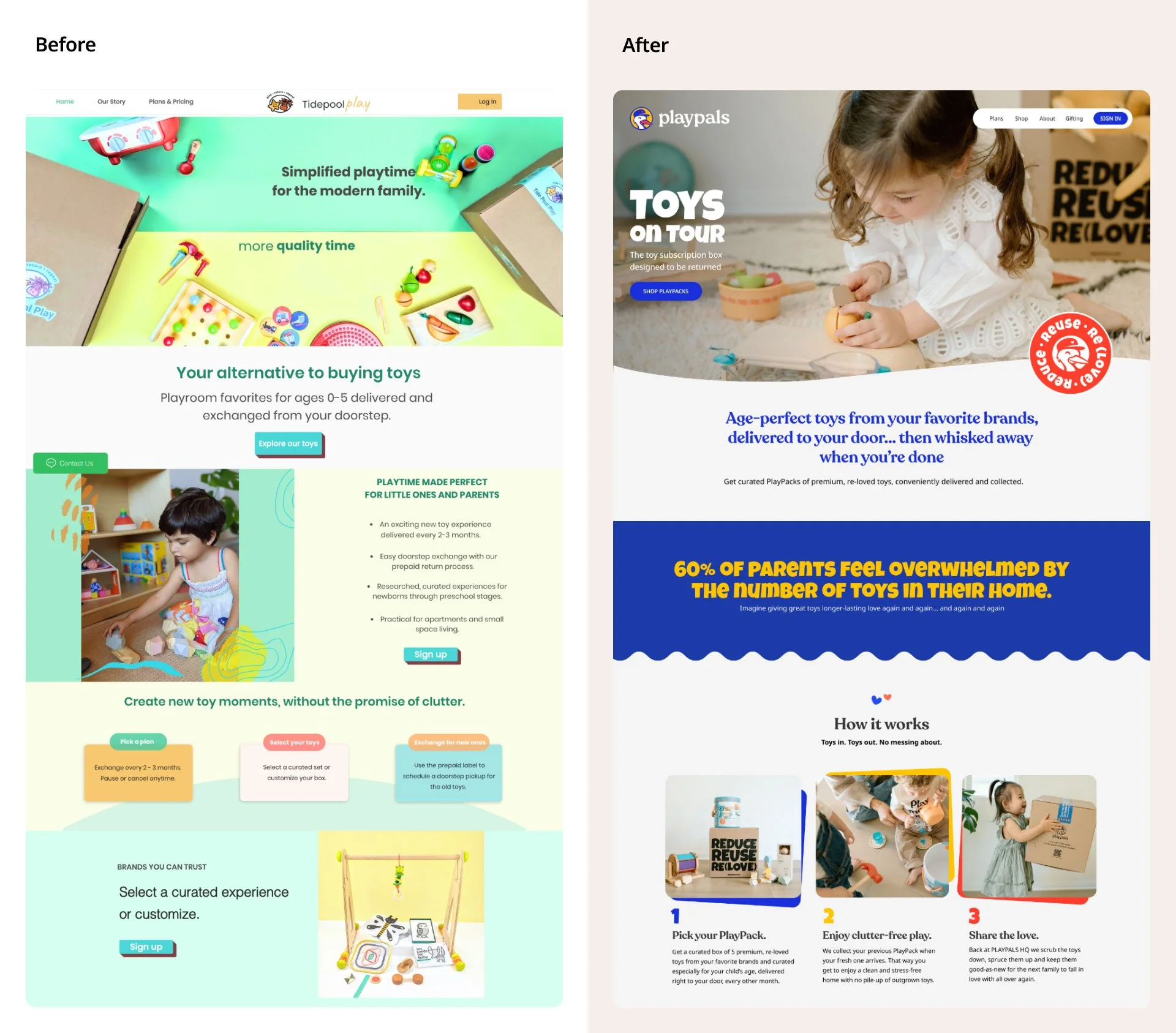
Nadisha had built something genuinely worth building. She created a toy sharing membership that delivered premium, curated toys to families and took them back when children outgrew them. The mission was clear. The offer was strong. But visitors landed on the website and left without converting, because the brand could not answer the one question every parent was silently asking in four seconds: is this actually for me? Too many competing promises created noise instead of clarity, the business name communicated nothing about what it did or who it served, and the language around reused toys triggered doubt rather than desire.
The Work
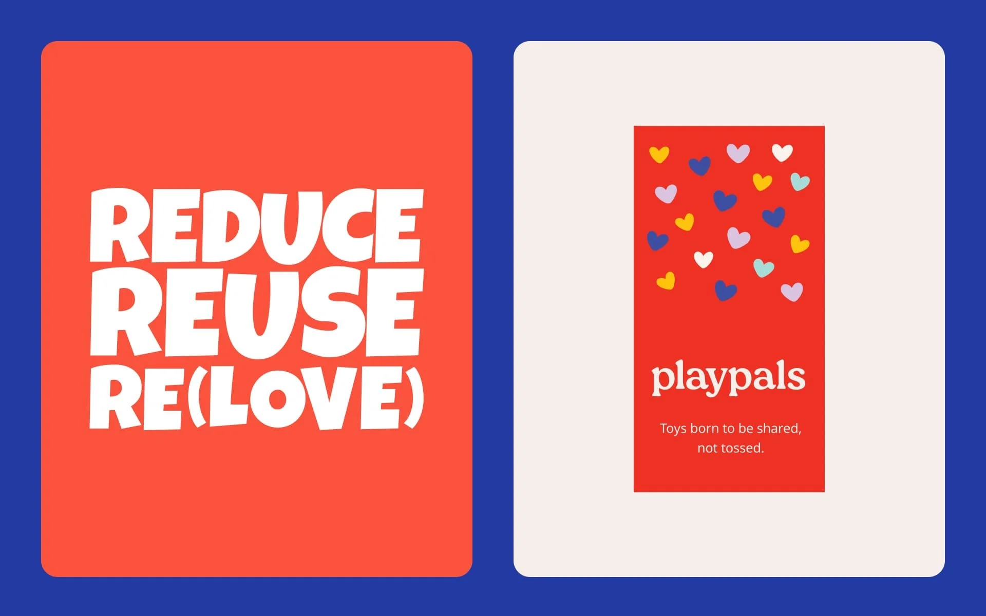
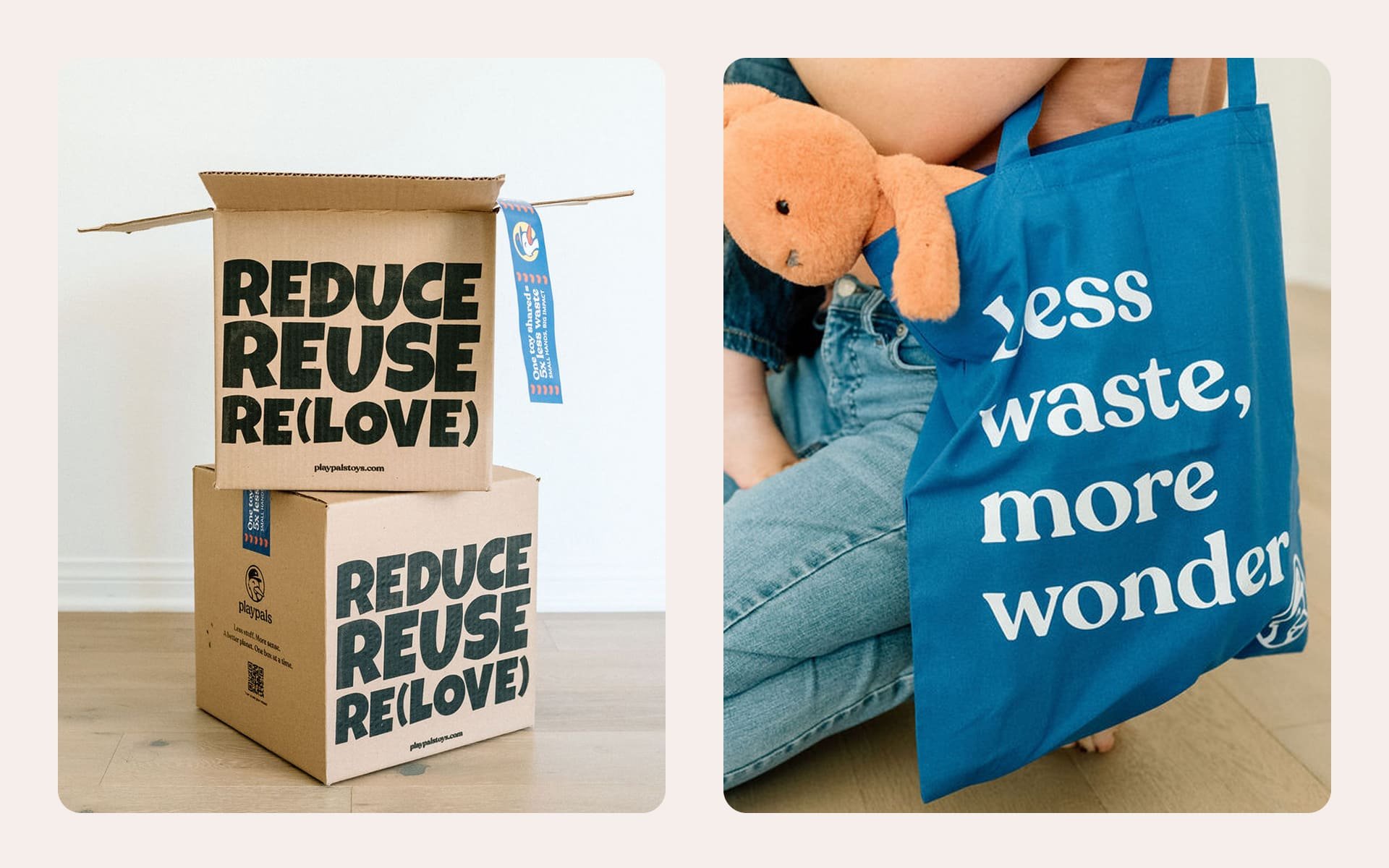
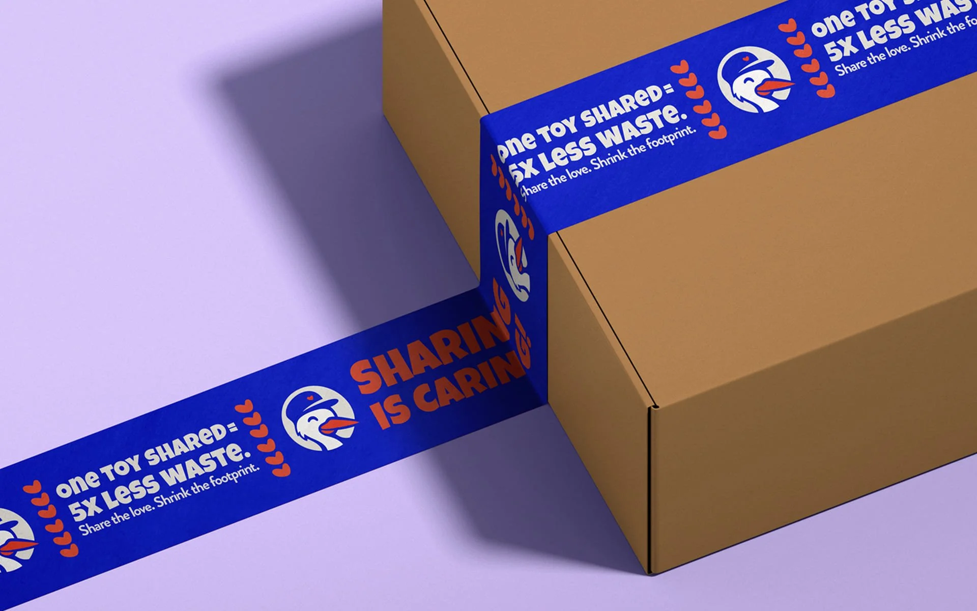
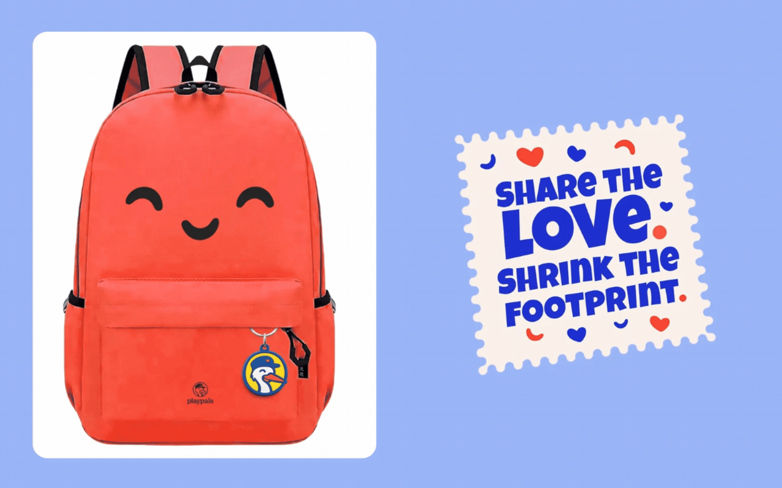
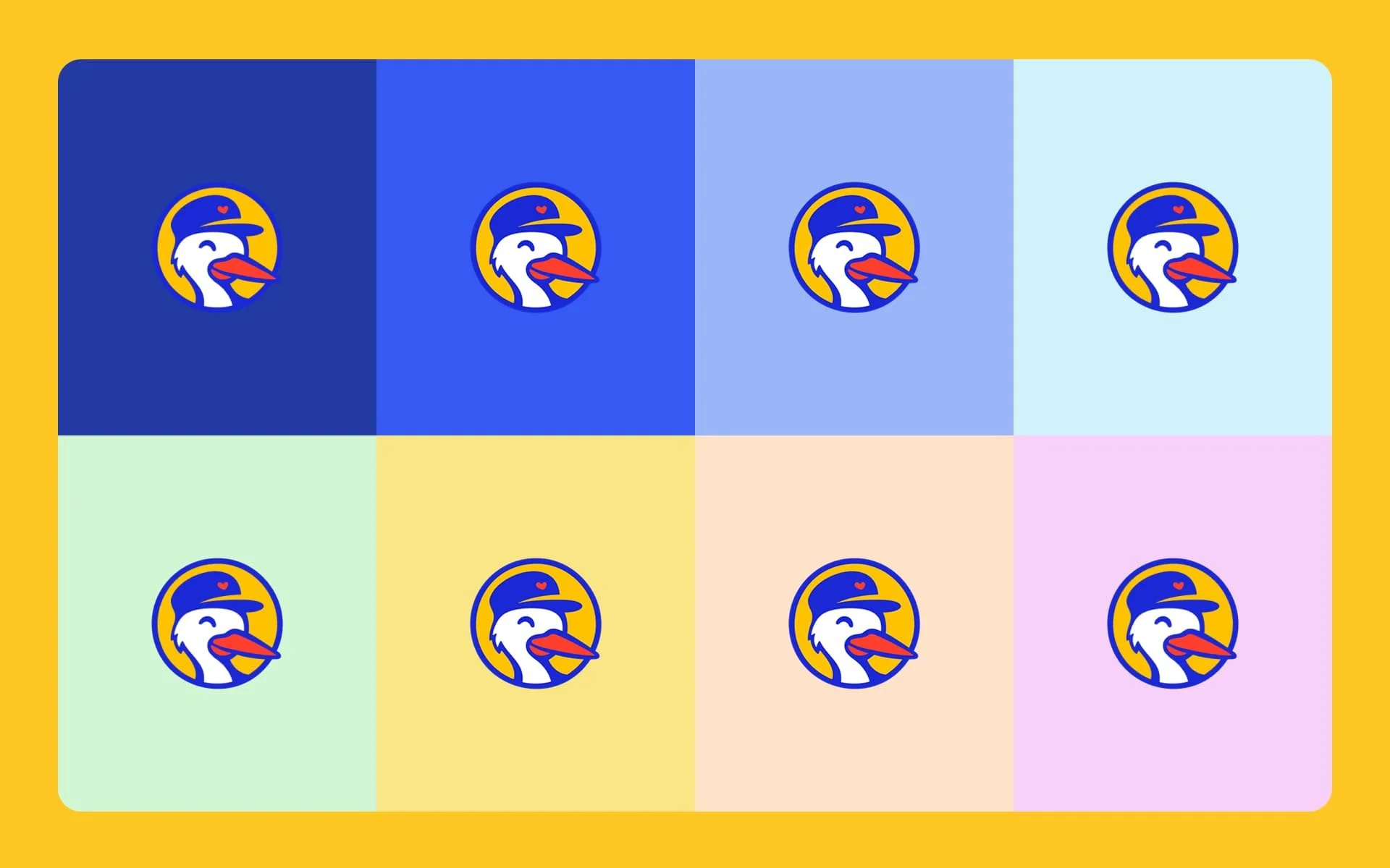
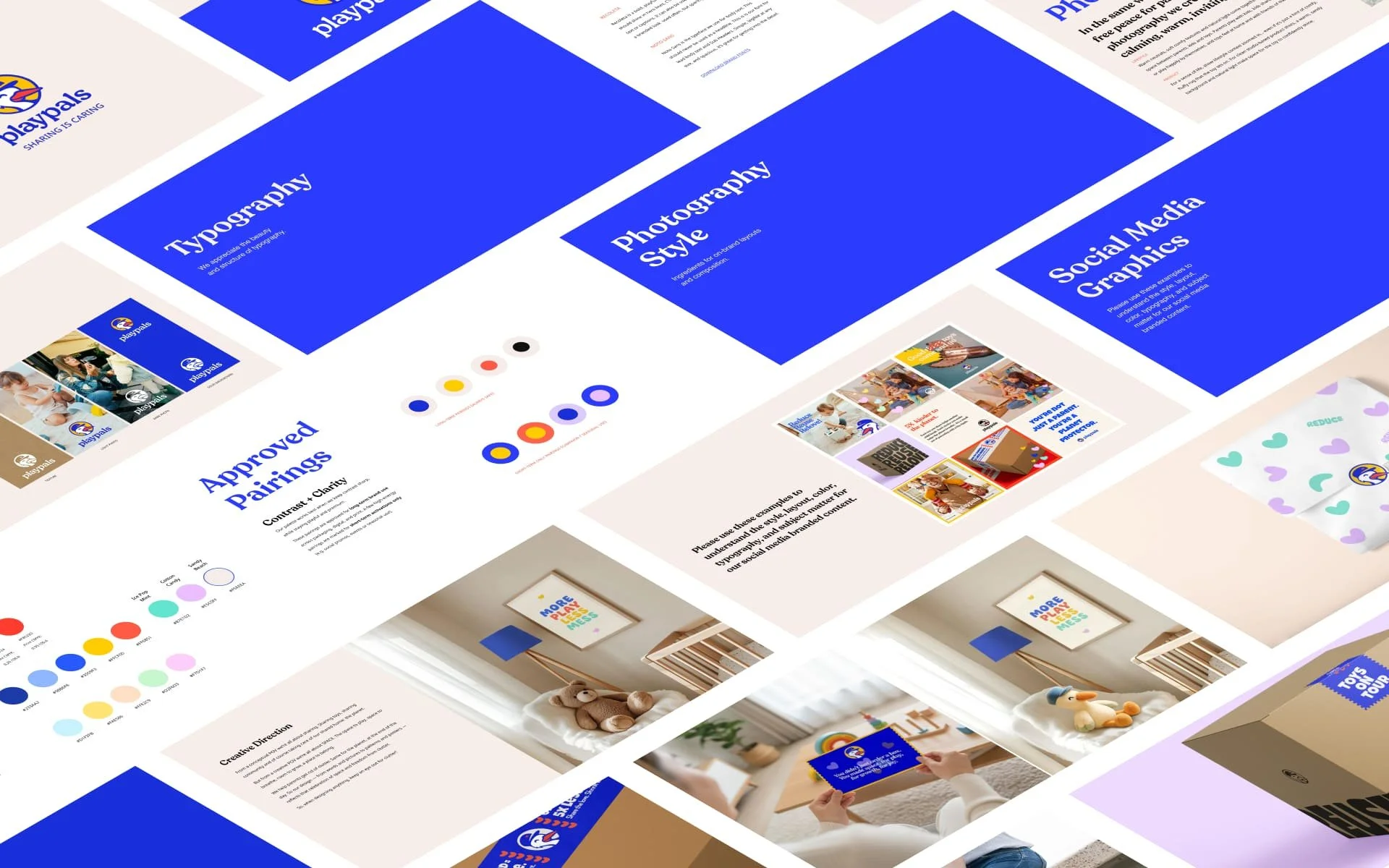
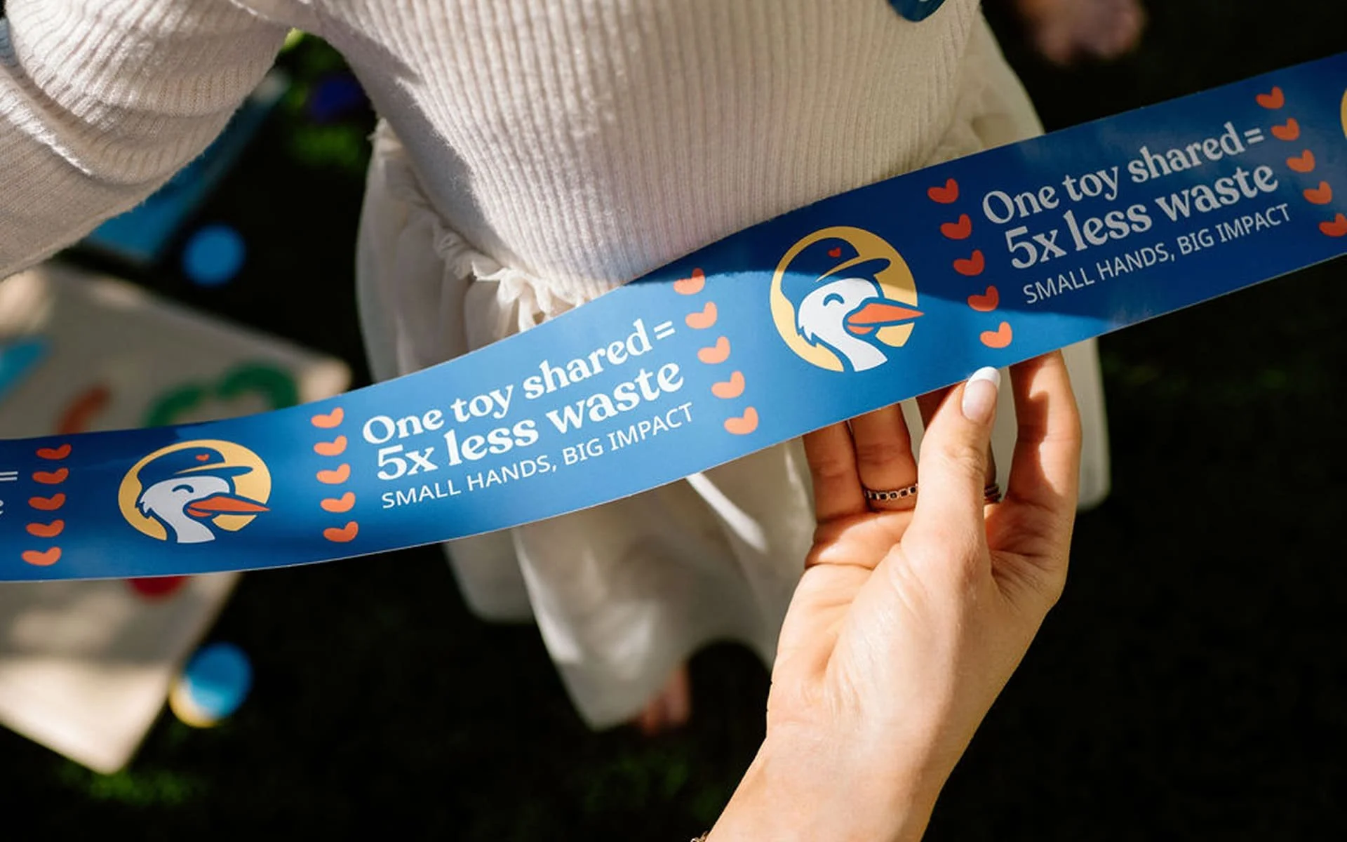
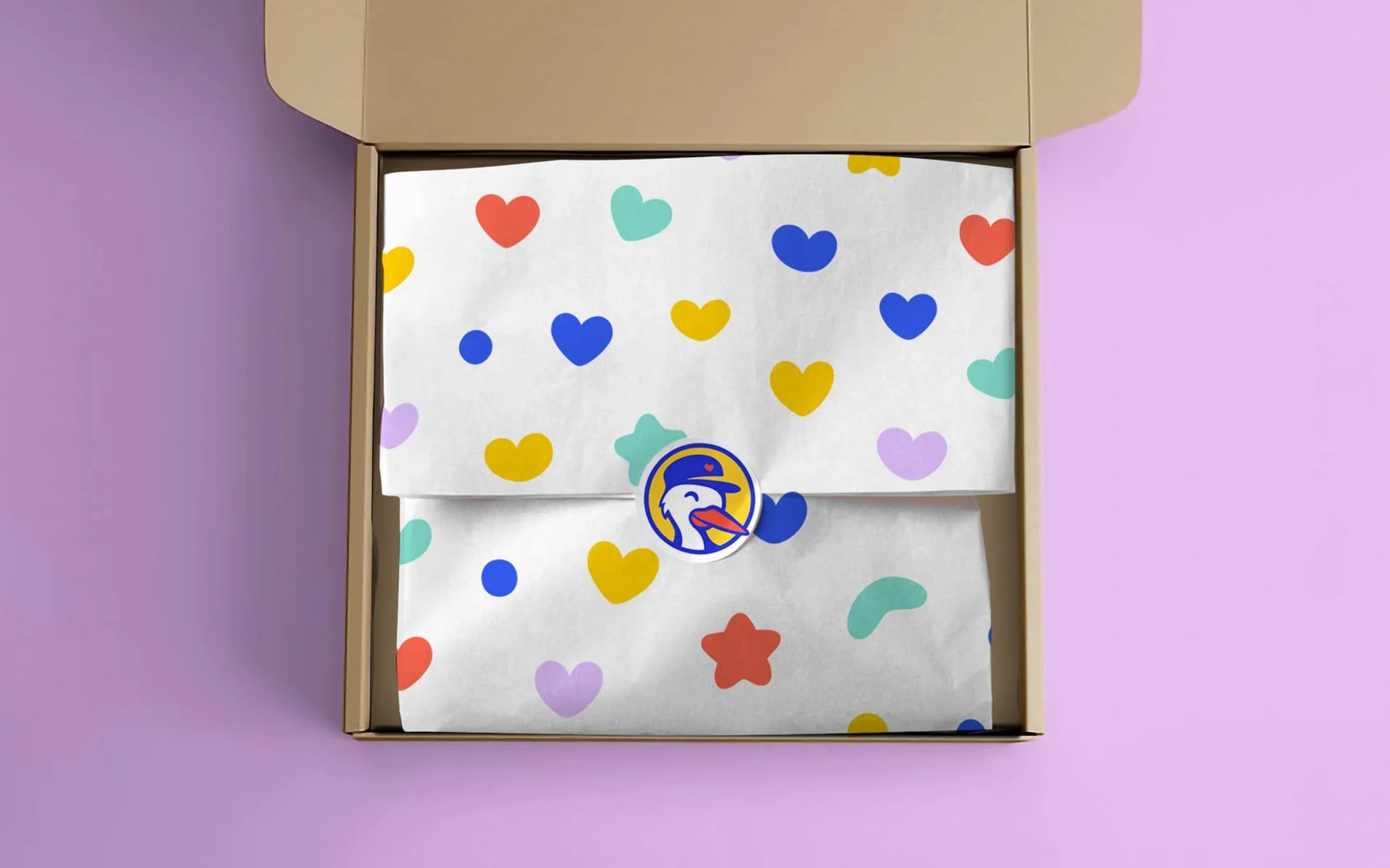
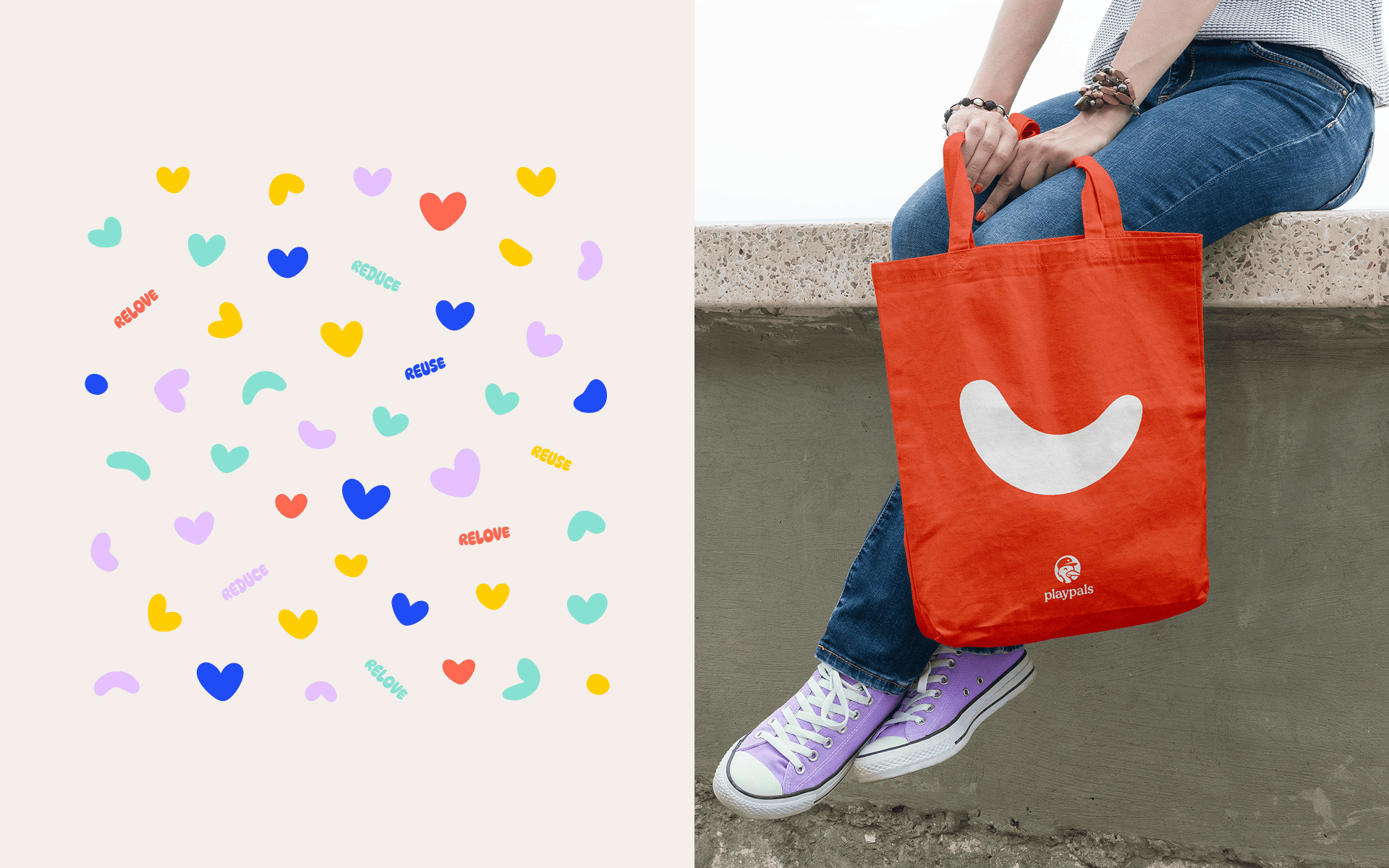
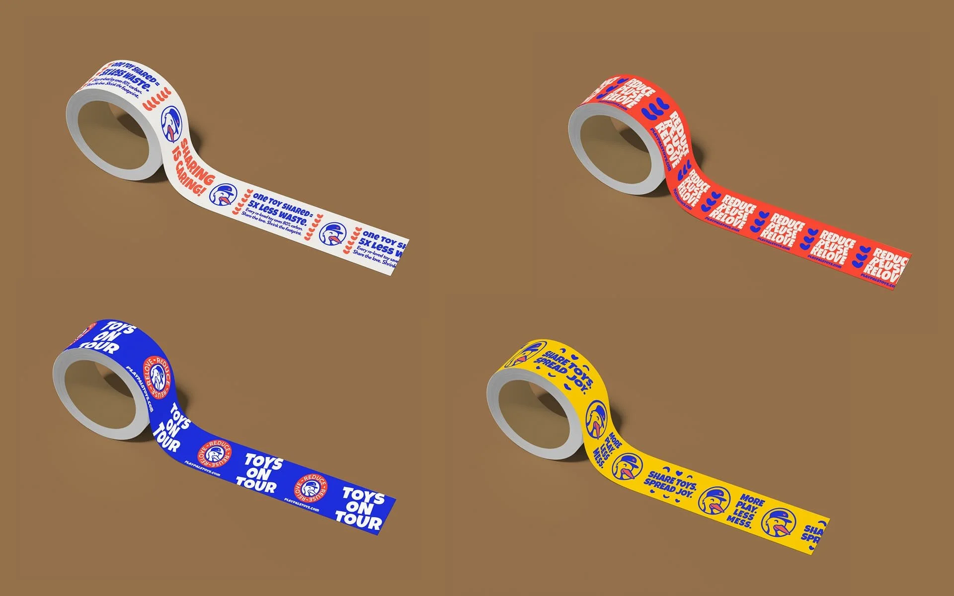
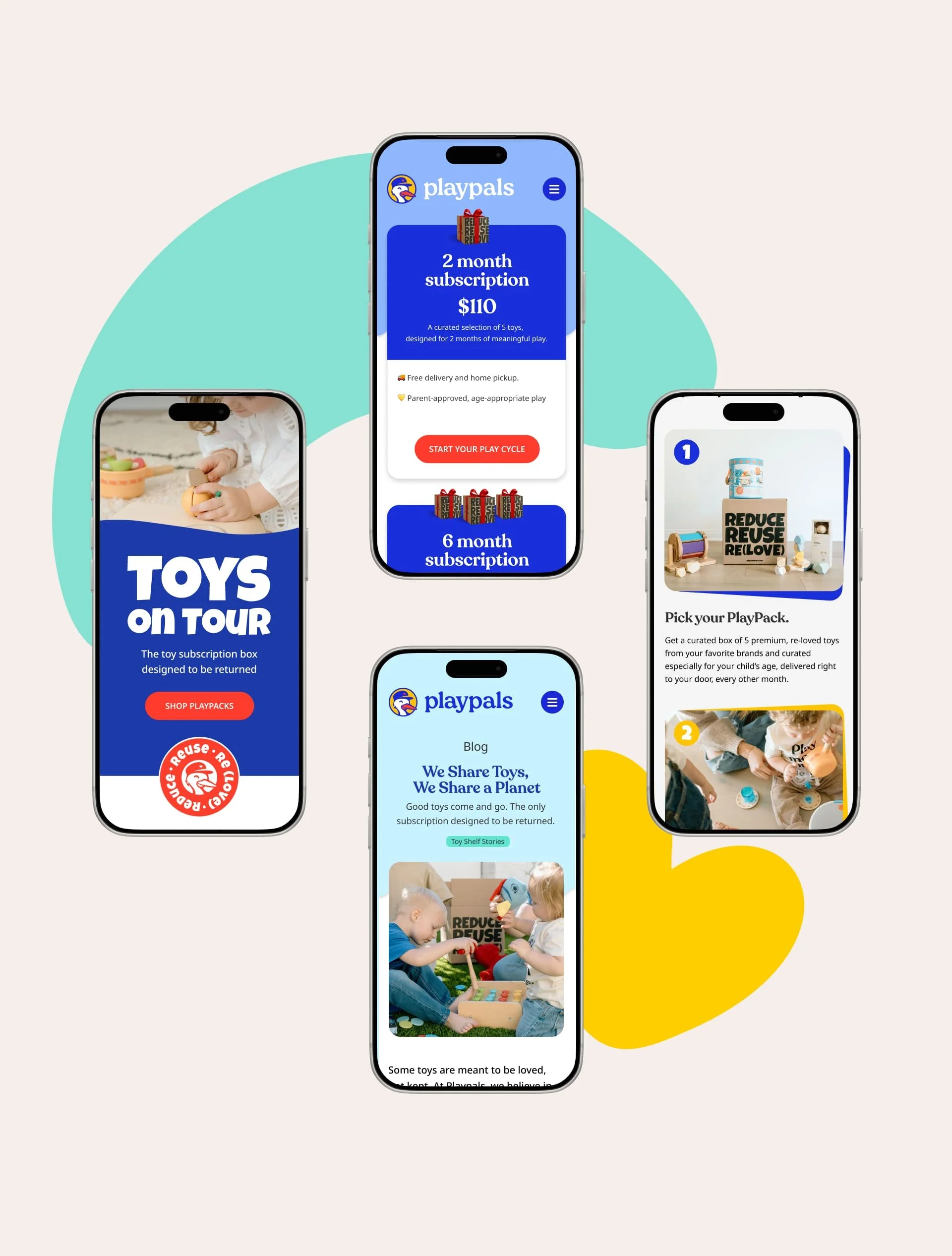
Mindsy identified that this was a positioning problem, not a marketing problem. The brand was speaking to what the founder believed rather than what the parent needed to feel. The diagnosis came down to one word: relief. Relief from clutter, from guilt, from having to choose between good parenting and a better planet. That single emotional anchor became the foundation for everything that followed, including a complete rename, a restructured message hierarchy built around the decision order of kids first, parents second, planet third, and a visual direction that balanced Montessori warmth with playful energy.
SCOPE
Architect
DELIVERABLES
Brand strategy and positioning
Brand rename
Messaging framework
Verbal identity
Message hierarchy and audience architecture
Visual identity
Visual direction and photography art direction
Brand experience touchpoint guidance
The Shift
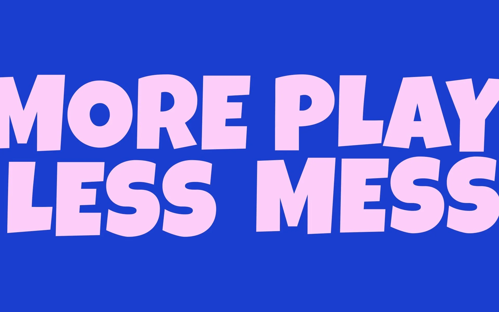
Playpals now converts because the brand answers the parent's question before she has to ask it. The name turns a buyer into a member. The language removes stigma and adds warmth. The message hierarchy follows the natural order of a parent's heart. What was once a hard-to-explain concept is now a single breath: better toys for kids, less mess for parents, less waste for the planet.


In her own words

“We knew what we were building. We just couldn't explain it clearly. Asha took care of everything — big picture and details. She asked questions no one else had asked. And she said no just as often as she said yes, which is what actually made us confident. Now we can explain what we do. We know who we're for. And we feel proud of the brand we show up with.”
Nadisha Silva
Co-Founder, PlayPals